We cannot stress enough the importance of multimedia such as images, infographics, and videos in development. However, the size of images affects the overall performance of an application and its usability.
HTML (hypertext markup language) is the most used language to design and create the structure of web pages. As a developer, you can add product pictures, logos, and other graphics to your HTML document to improve user experience and visual appeal.
However, if you need the application to function optimally, you must resize and optimize your images. In this article, I will explain the importance of resizing images, the different approaches to resizing images in HTML, and the best practices.
What is the importance of resizing images in HTML?

Resizing an image is scaling up or down the size of an image. Typical images are stored in different forms, and you can get them from your photographer, events, or designer or download them from online sources.
You may be tempted to use images in their original formats. However, in most cases, this is not desirable. These are some of the reasons why you should resize images in your HTML document:
- Page load speed: Although images are known to improve user experience, having large images may negatively affect the loading speed. Optimizing such images will make your web pages load fast.
- Make your website responsive: A typical web/application receives visits from people using varying devices. Resizing images makes a web page responsive to mobile devices, desktops, and tablets.
- Bandwidth usage: Most website hosts limit bandwidth when selling hosting packages to website owners. When you optimize images, you get more space for other types of content on your website.
- SEO purposes: Page loading speed is one of the ranking factors that search engines consider. Resizing your images improves the loading speed, which eventually boosts your SEO.
- Maximize storage: The size of storage space is one of the factors to consider when selecting a web host. Uploading large and high-resolution images may consume a lot of storage space on the servers.
- Improve user experience: Website users don’t have to wait ages before images load on a web page. You can optimize your images to appear simultaneously with the rest of the content.
These are the different ways to resize images in HTML
Using HTML attributes
We can create a simple application to demonstrate how to resize images. I will be using images from Pixabay in my web application. I will use this image. You can download it and move it to your project for easy demonstration.
This is my HTML code:
<!DOCTYPE html>
<html lang="en">
<head>
    <meta charset="UTF-8">
    <meta name="viewport" content="width=device-width, initial-scale=1.0">
    <meta name="description" content="Your website description">
    <meta name="keywords" content="your, keywords, here">
    <meta name="author" content="Your Name">
    <title>Resize HTML Images</title>
</head>
<body>
    <h1>My Cat</h1>
    <img src="images/cat-2536662_1280.jpg" alt="cat image">
</body>
</html>
When I render the original image without resizing, it is all over the web page, and you can’t even see the image.

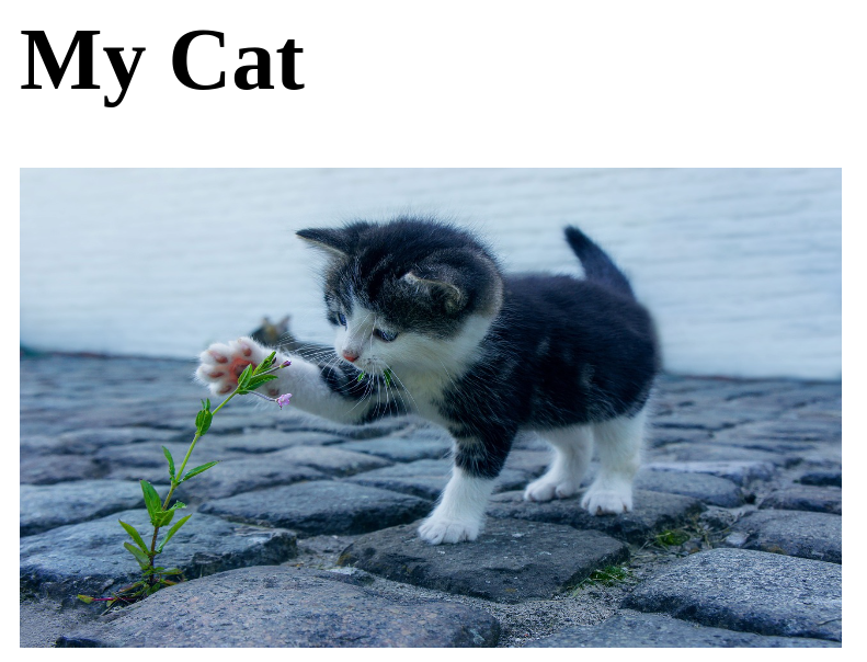
I can give my cat image a height of 175 and a width of 300.
I will change my code in the <img> tag as follows:
<img src="images/cat-2536662_1280.jpg" alt="cat image" width="300" height="175">You can now see the image is visible and optimized.

Using CSS Styles
We can create a separate style sheet instead of the inline styling we applied in the above step. I will create a style sheet and name it styles.css. We will place a <link> tag within our HTML document’s <head> section to link the stylesheet with the HTML document.
<!DOCTYPE html>
<html lang="en">
<head>
    <meta charset="UTF-8">
    <meta name="viewport" content="width=device-width, initial-scale=1.0">
    <meta name="description" content="Your website description">
    <meta name="keywords" content="your, keywords, here">
    <meta name="author" content="Your Name">
    <title>Resize HTML Images</title>
    <link rel="stylesheet" href="styles.css">
</head>
<body>
    <h1>My Cat</h1>
    <img src="images/cat-2536662_1280.jpg" alt="cat image" >
</body>
</html>
We can add styling to our image through the styles.css sheet. This is our code:
img {
    width:300px;
    height:200px
}
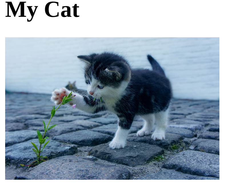
The rendered image will appear as follows:

We have used the <img> selector to locate our image on the HTML document. We have given our image a width of 300px and a height of 200px.
Using Percentage
In the previous example, we have used pixels (px) to resize our image. We can also use percentages to optimize our image. For instance, we can set the width and height of our image to 65%.
We will use our previous HTML code. However, delete what is in the styles.css file and add this code:
img {
    width:65%;
    height:65%
}
When you render the image, you will get the following:

Resizing Images for Responsive Design
A good image should be responsive to different screen sizes. You can also optimize your image to respond to different screen sizes. Using the same HTML code, we can add this to our styles.css file:
img {
    max-width: 100%;
    height: auto;
}
The max-width: 100% property ensures that the image will never exceed the width of its container. As such, the image will always scale down proportionally on smaller screens.
The height: auto property ensures that the image maintains its aspect ratio as it scales up and down.
Maintaining the Aspect Ratio
In web/app design, the aspect ratio is the proportional relationship between height and width. Maintaining the aspect ratio while resizing or optimizing your images ensures that they maintain visual consistency; the images are not distorted and are responsive to different screen sizes.
We will use the same HTML code to demonstrate how to maintain the aspect ratio while resizing our images.
Add this code to your styles.css file:
img {
    width: 300px;
    height: auto;
}
I have used the ‘img’ selector to locate our image in the HTML document. We have set our width as 300px. The height: auto property allows different browsers to automatically calculate the height of the image while maintaining the aspect ratio. This ensures the images aren’t stretched while rendered on different screen sizes.
Resizing Background Images
You can insert images on elements to serve as background images. Resizing a background image ensures that it will fit inside its container. This is an example of an HTML document with a paragraph and some text:
<!DOCTYPE html>
<html lang="en">
<head>
    <meta charset="UTF-8">
    <meta name="viewport" content="width=device-width, initial-scale=1.0">
    <meta name="description" content="Your website description">
    <meta name="keywords" content="your, keywords, here">
    <meta name="author" content="Your Name">
    <title>Resize HTML Images</title>
    <!-- Link to external CSS file -->
    <link rel="stylesheet" href="styles.css">
</head>
<body>
    <div class="container">
        <div class="text">
            <p>This is our cat image</p>
        </div>
    </div>
    </body>
    </html>
We can now add a background image through the styles.css sheet.
.container {
    position: relative;
    text-align: center;
    color: #ffffff;
    padding: 100px;
    background-image: url('images/cat-2536662_1280.jpg');
    background-position: center;
    width: 75%;
}
.text {
    position: absolute;
    top: 50%;
    left: 50%;
    transform: translate(-50%, -50%);
    font-size: 24px;
    color: orangered;
}
A background image can only be added using CSS. I have created a container with centered text and a background image of a cat.
Using Image Resizing Tools
You can use different tools to resize and optimize your images. Some of these tools only offer you a resizing feature. However, some will also allow you to store images and serve to your HTML file using a URL.

Cloudinary is a good example of a tool that resizes the image on the server before it delivers it to the users. This tool is designed to automatically resize images without impacting site performance.
Best Practices for Resizing Images in HTML
Although we have discussed several approaches for resizing images in HTML, you should always stick to these best practices for optimal results:
- Avoid inline styling: You may be tempted to quickly style images from your HTML documents and move to the next part. However, this approach may negatively affect the web page loading speed. Use a separate CSS styling sheet and make your code easy to read and maintain.
- Use ‘width’ and ‘height’ attributes: Ensure you specify your images’ width and height. This approach directs the browser to automatically allocate the image space as the rest of the content loads.
- Use the correct image formats: Images come in different formats, such as JPEG, PNG, and SVG. For instance, PNG is a perfect format for a transparent image, while SVG suits logos.
- Make your images responsive: You may never know the nature of your website visitors’ devices to access your content. Always optimize the images for different screen sizes and ensure uniformity in display.
- Optimize the file sizes: Raw high-quality images might come in big files. However, such images might take up a lot of space on your server and affect page loading times. You can reduce the size of such images using various tools without lowering their quality.
Conclusion
Resizing your images in HTML improves user experience, makes your web page responsive, and saves on server space. We have presented you with several approaches to resizing images in HTML.
Even though they are all effective, I love using CSS properties in a separate CSS file to resize the images. However, you can sometimes add inline CSS if your application is small and you have a few images.
You can also read our article on CSS Resources and get a deeper understanding of this styling language.

