Cloudflare is a global cloud network protecting businesses and accelerating internet apps such as websites, APIs, distributed workforce, and corporate networks with thousands of servers across the globe.
With Google’s focus on usability, speed, and security, you can use Cloudflare to boost your site’s presence and potentially gain traffic due to improved uptime and speed.
What is Cloudflare?
Cloudflare is a USA-based cloud company that provides services to protect, optimize, and deliver fast apps across the internet. It offers Internet-native zero-trust security for contractors, networks, apps, and data, offering unified SASE and SSE (Security Service Edge).
In simpler terms, Cloudflare is a content delivery network and reverse proxy cloud provider (offers a proxy server between the actual server and visitors). According to Enlyft, Cloudflare has a 36.7% market share, with 26% of Cloudflare customers from the United States.
The Cloudflare customer base is 64% small businesses, followed by 23% medium-sized and 13% large businesses (based on the number of employees). As for revenue, Cloudflare saw a 33% year-over-year increase, totaling $1,296.7 million for 2023.
Benefits of Cloudflare
Cloudflare brings many benefits, primarily improving the site’s speed and security. It provides a CDN that offers protection from Distributed Denial of Service (DDoS) and a full-fledged Web Application Firewall (WAF) that protects the site against potential threats such as cross-site scripting or SQL injection. With a global network of servers, it also provides load balancing, optimized network routing, and more.
Let’s learn about Cloudflare’s 16 major benefits in detail.
Minification
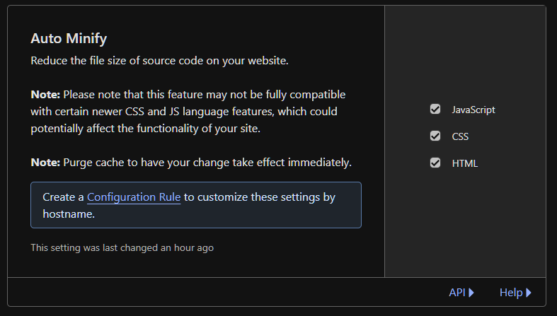
Cloudflare offers the auto minify option, which improves website performance. The minification process (dynamic for HTML and non-dynamic for CSS and JS files) removes unnecessary space, including whitespaces, newline characters, and comments, to save space and reduce file size.
To enable auto minify, log in to the Cloudflare dashboard and select your account and the website. From there, go to Speed > Optimization > Content Optimization.
Select the file type (HTML, CSS, or JavaScript) to minify. That’s it; your site is now being minified.
HTTP/3 Protocol
Cloudflare supports the new HTTP/3 (runs on Google’s transport protocol QUIC), an upgrade to the hypertext transfer protocol since HTTP/2 (released in 2015).
The new HTTP/3 overcomes HTTP/2 drawbacks, including:
- Improving its sluggish performance when switching from WiFi to cellular data
- Minimizing the effects of the head-of-the-line blocking problem where one packet of information not reaching the destination leads to blocking all streams of information.
HTTP/3 also brings other benefits, including:
- Zero round-trip time (O-RTT), which bypasses handshake requirements for servers already connected to clients.
- Improved comprehensive encryption thanks to QUIC’s new handshake approach, which applies encryption by default.
- Faster connection establishment as QUIC allows TLS negotiation along with transport and cryptographic handshakes.
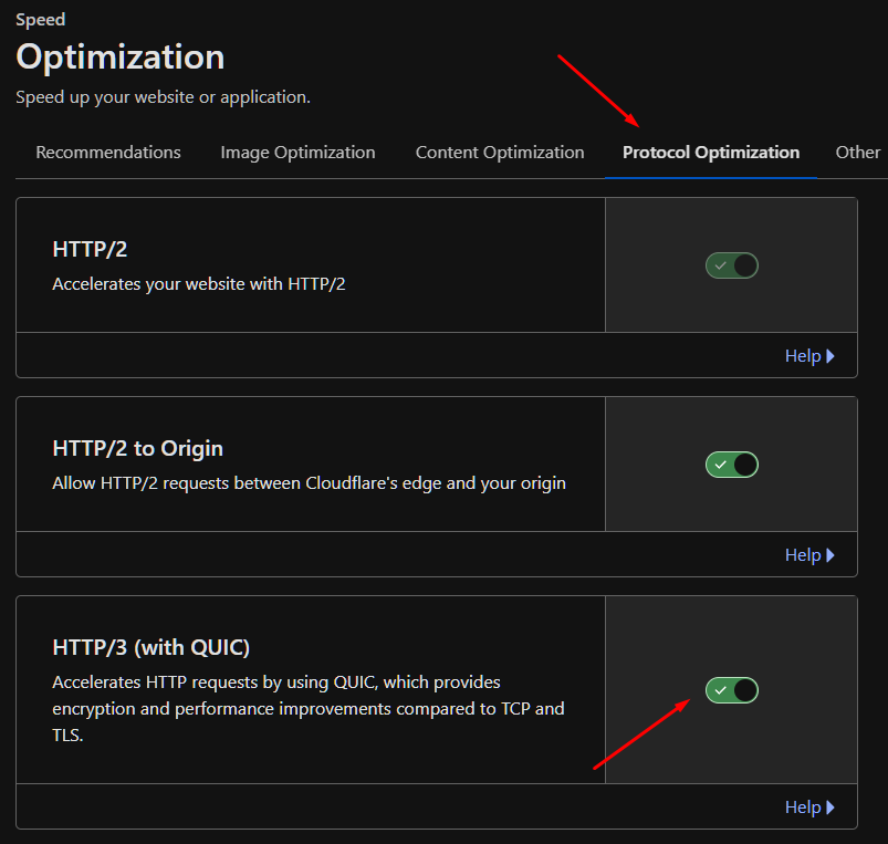
HTTP/3 is available on all Cloudflare plans, including the free plan. To enable it, go to Speed > Optimization > Protocol Optimization. From there, toggle ON “HTTP/3”.
Free SSL
Free SSL is one of the best Cloudflare advantages. It ensures that all the data transferred between client and server is encrypted and safe from malicious actors.
Cloudflare SSL offers the following benefits:
- Access to Total SSL that automates certificates to all subdomain levels.
- Removes manual intervention by delegating domain control validation (DCV) to Cloudflare.
- Uses custom TLS settings, modifying security requirements according to your site/website.
However, the free SSL doesn’t offer all the above features. To access it, you need to get the Advanced Certificate Manager addon, which costs $10 monthly.
Free SSL is automatically enabled by default. However, you can change its encryption mode between Flexible, Full, Full (Strict), and Off by going to SSL/TLS > Overview.
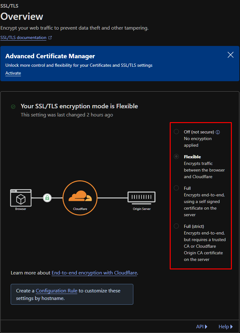
Note: Flexible encryption mode can lead to the “too many redirects” error. To solve it, use Full encryption mode.
DNS Security
DNS Security adds another layer of security by protecting DNS infrastructure from cyber attacks such as request forgery, stealing data, DNS spoofing, and DNS hijacking, among others. Additionally, Cloudflare DNS is free.
When a user requests a site, the very first step is to resolve the DNS. By acting as a DNS resolver, Cloudflare creates a trustworthy gateway, protecting against request forgery.
With Cloudflare DNS security, you can:
- Create a DNS policy to allow or block traffic based on the query or response parameters such as source IP, geolocation, and domain.
- Enable DNS security protocols such as DNSSEC.
- Offer DNS firewall to improve DNS server security and performance.
- Offer DDoS migration to allow servers to handle traffic spikes.
- Cloudflare DNS load balancing to improve server performance
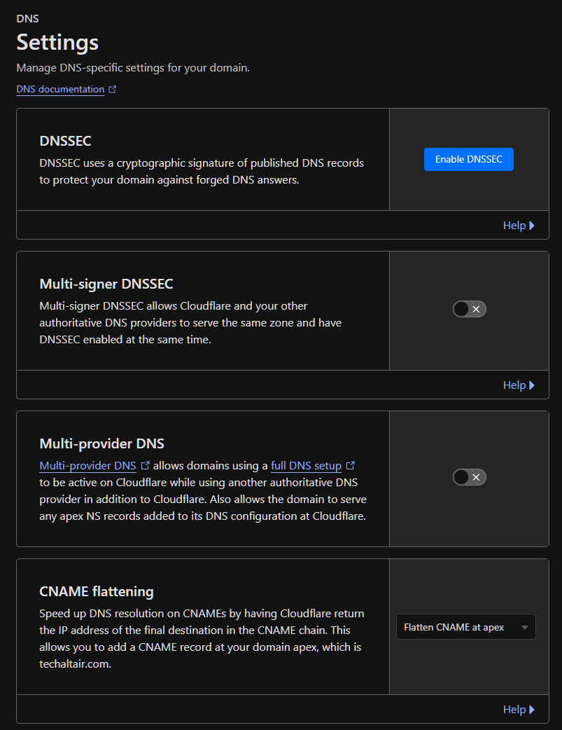
To change DNS security parameters, you need to go to DNS > Settings. There, you get plenty of options, including the ability to enable DNSSEC.
Cloud WAF
Cloudflare Cloud Web Application Firewall (WAF) is a layered defense against a plethora of cyber-attacks, including the top 10 OWASP vulnerabilities. It is available on PRO or above plans.
Apart from managed rules (that protect against zero-day vulnerabilities), you can add a custom ruleset to block threats.
Additionally, other Cloud WAF features include:
- WAF machine learning ensures that variation attacks, such as XSS or RCE, don’t bypass the WAF.
- Check for exposed credentials to protect against account takeover.
- Set advanced rate limiting, preventing brute force attacks.
- Sensitive data detection alerts for sensitive data responses.
To access WAF settings, go to Security > WAF.

Image Optimization
Another reason to use Cloudflare is its image optimization feature. With the PRO plan or above, you can use Cloudflare image optimization to store, optimize, transform, and deliver images to a vast network with excellent scalability.
To better understand, Cloudflare offers key image features:
- Transform images: Optimize or manipulate images (resize, convert, preserve metadata, or save animations) stored outside Cloudflare Images product.
- Polish images: One-click image optimization optimizes images for faster loading times.
- Mirage: Improves mobile page load time with slow network connections.
Cloudflare also offers Cloudflare Images API for bulk operations with up to 100 variants per request.
Go to Speed > Optimization > Image Optimization to access image optimization settings.
Browser Caching
Browser caching is an age-old technique that stores a site’s files locally for faster load times. Cloudflare’s browser caching ensures that static resources such as images, webpages, or videos are stored longer.
You can set Cloudflare to use default cache behavior or optimize the website by configuring cache rules. Furthermore, you can also enable Tiered Cache, which improves cached content delivery from multiple locations.
To access Caching features, go to your Profile > Site > Caching.
WebSockets
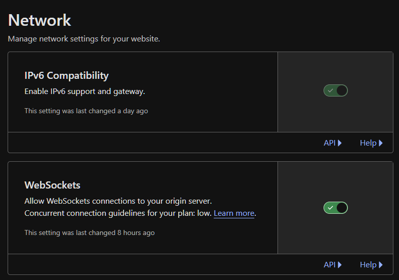
Cloudflare offers WebSockets support without any manual or additional configuration. All you need to do is go to your specific domain (in your Cloudflare account) > Choose Network > WebSockets. Now toggle it “ON”.
WebSockets are available across all plans (including the free plan); however, there is a limit on the volume of concurrent connections based on your plan.
Load Balancing
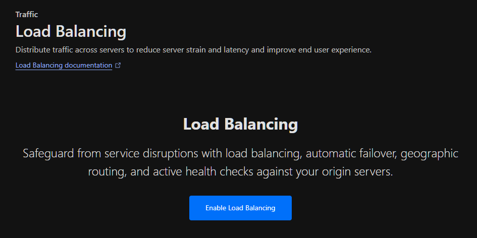
Load balancing is a Cloudflare performance feature that distributes the traffic, reducing server strain and improving user experience. It handles traffic spikes with no downtime, offering a consistent user experience, which a load balancer excels at. Other benefits include geographic routing, health checks, and automatic failover.
To enable load balancing, go to Traffic > Load Balancing > Enable Load Balancing.
Optimized Network Routing
Cloudflare’s new service, Agro, enables businesses to optimize network routing to improve content delivery. It manages network congestion through a real-time understanding of the Cloudflare network, ensuring the data’s most reliable and fastest network paths.
It is a paid service available on all the plans. Its benefits include:
- 30% faster web assets performance.
- Improved reliability and uptime.
- Integrated end-to-end encryption.
- Reduced code due to the use of a low-latency origin server.
Page Rules
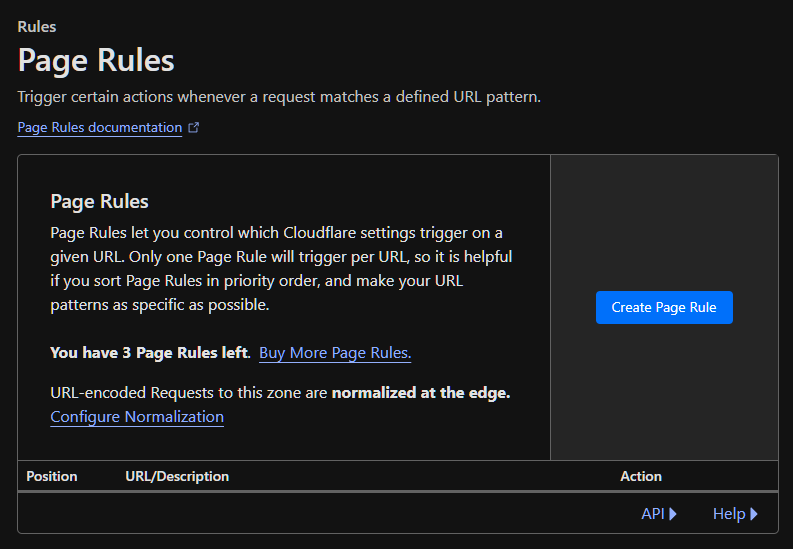
Cloudflare’s Page Rules (paid service) enable you to take complete control over your site, including URL and subdomains. For example, you can customize things like:
- Cache level
- Redirection
- Rocket loader customization
- Automatic HTTP rewrite
- Web application firewall customization
To create a Page Rule, go to Rules > Page Rules and Create Page Rule.
AMP Real URL
Accelerated Mobile Pages Real URL by Cloudflare lets you improve your mobile experience by faster loading AMP content, improving SEO, and retaining URL attribution of the original URLs in Google’s mobile search results.
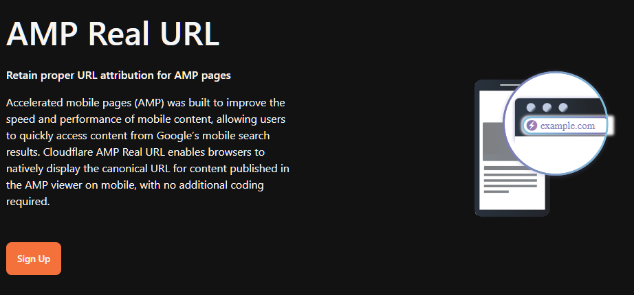
To ensure correct attribution, AMP Real URL uses signed HTTP exchanges to authenticate the publisher’s content.
Rate Limiting
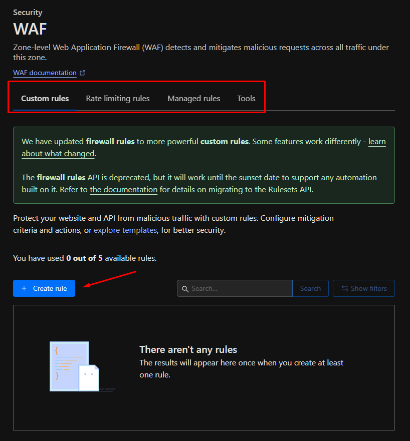
Cloudflare’s Zone-level Web Application Firewall (WAF) lets you set rate limiting rules, therefore protecting your API or site from various malicious intent such as brute force attacks or denial-of-service (DoS). Here, you can configure the mitigation criteria as per your requirements.
Rate limiting is available on all plans, with higher plans offering more rules creation.
To create rate limiting rules, go to Security > WAF > Rate limiting rules.
DDoS Protection
Cloudflare offers extensive DDoS protection thanks to its 248 Tbps network that spans around 120 countries and 310 countries, blocking an average of 182 billion daily threats.
Their DDoS services can protect websites, applications, and networks. The website protection is available in a free plan with paid options for more bandwidth and protection.
It is easy to set up via the Cloudflare dashboard or using API. To access it, go to Security> DDoS. You’ll notice that Cloudflare has already deployed a managed DDoS protection. However, you can deploy a DDoS override if needed.
Workers
Cloudflare Workers let developers deploy serverless code instantly to the global audience. It brings tons of benefits, including automatic scaling, access to a high-performance global network, and support for 0ms cold starts, which means instantly running the code.
Developers can kickstart app building using templates in different languages, including JS, C++, Rust, and C. Moreover, it is affordable, with the initial 100K requests each day for free and paid plans starting as low as $5 per 10 million requests.
Zero Trust
Cloudflare Zero Trust model enables Cloudflare to improve internet security by replacing legacy security parameters. Its benefits include:
- Offering a secure web gateway.
- Zero trust access.
- Safeguarding data in the cloud.
- Data loss prevention solution.
- Fast and reliable remote browsing.
Cloudflare’s Contribution to Improving Website Security, Performance, and SEO
Cloudflare improves website security by providing WAF, SSL certificates, and a DDoS protection system capable of protecting against various cyber-attacks, including SQL injection, brute-force attacks, and malware, among others. Most of the protection systems, such as DDoS protection, are enabled automatically. However, a few security parameters, such as SSL certificate and WAF, must be configured to get the most value.
To improve website performance, Cloudflare offers CDN that enhances the site’s speed and reliability with its massive network across the globe. The CDN provides scalability, ensuring optimal response time during peak hours. Furthermore, it offers other additional Cloudflare features such as minification, HTTP/3 protocol, WebSockets, load balancing, page rules, and workers, which directly help improve website performance.
All these Cloudflare protection-related and performance-related features directly impact the site’s SEO. For example, it offers image compression tools for improved performance, whereas the redirects feature allows you to solve errors. Cloudflare’s caching system is also useful in this scenario as it helps the sites load faster and reduces bandwidth costs.
Cloudflare Pricing
Cloudflare offers a freemium pricing model for application services, developer platforms, zero trust and SASE (Secure Access Service Edge) plans. For network services that manage on-premise and hybrid networks, you need to contact them for custom pricing.
The application service paid plans include Pro, Business, and Enterprise. The Pro plan starts at $20 monthly, whereas the Business plan starts at $200 monthly. The Zero Trust and SASE have a pay-as-you-go plan, which starts at $7/user/month. Lastly, the developer platform’s Workers Paid plan starts at $5 monthly and offers 10M monthly requests.
| Category | Offers Services For | Plans | Features |
|---|---|---|---|
| Application Services | Application security and performance | -FreePro at $20 monthly -Business at $200 monthly -Enterprise at custom pricing | DNS, CDN, DDoS protection, free managed ruleset, WAF, AMP, image optimization, bot migration. |
| Zero Trust and SASE | Employee applications and devices | -Free plan -Pay-as-you-go plan at $7 per user -Contract plan (best for organizations) with custom pricing | Activity logging, application connector software, zero-trust network access, device client software, secure web gateway, inline-cloud access security broker, remote browser isolation. |
| Network Services | On-premise and hybrid networks | -Magic Transit -Magic WAN -Magic Firewall -All custom pricing | Mitigate attacks, native integration with L7 services, support for all IP services, unified management plane, fast routing with Agro, Geo-blocking. |
| Developer Platform | Serverless applications | -Workers Free -Workers Paid at $5 monthly | Access to developer platform products, up to 1 GB of storage, full CLI deployment capabilities, automatic global deployment. |
Who Should Use Cloudflare CDN?
Cloudflare CDN can be used by businesses of all sizes, including small, medium, and enterprises, due to its direct impact on site/service/platform security, performance, and availability.
With a powerful CDN like Cloudflare, your business minimizes the risk of downtime, malware infection, DDoS attacks, or scalability issues.
If you opt to use Cloudflare CDN, you get 4 major benefits.
- Reduced bandwidth costs thanks to caching and other CDN optimizations.
- Increased availability, capable of handling traffic surges.
- High-level, robust security with DDoS protection.
- Higher chance of ranking better.
Frequently Asked Questions
There are 6 distinct advantages of using Cloudflare security solutions.
– Protection against cybersecurity threats such as malware attacks and SQL injection.
– Improved performance, especially during peak traffic
– Protection for remote teams from phishing and other internet risks
– Ability to mitigate ransomware attacks
– Next-gen firewall that stops unwanted or malicious traffic
– Offers application and API security, protecting them against bots, DDoS attacks, and thwarting malware payloads.
Yes, Cloudflare is worth your time and money (you can start with its free plan). It offers a plethora of security and performance features, ideal for new or sophisticated high-end web applications. Also, is Cloudflare trustworthy? Yes, it is.
The are 5 major benefits of using CDN.
– Faster web page/application laid time due to caching and closer proximity to the cached server.
– Cost savings with less reliance on the origin server.
– Improve search engine ranking, as speed is a factor for ranking higher.
– Protection against cyber security potential threats.
– Scalability and reliability with the use of techniques such as load balancing.
Cloudflare’s autonomous edge and centralized DDoS systems protect websites from DDoS attacks by absorbing the additional traffic through its redundant global and local network. It constantly looks for any form of DDoS attack by doing traffic analysis that does packet-level sampling. Additionally, it generates real-time signatures and matches them against attack patterns.
Yes, Cloudflare can have a positive impact on a website’s SEO ranking due to improvements in speed, reliability, and security (SSL/TLS), which search engines like Google see as a positive ranking sign.
Yes, Cloudflare is suitable for small websites and blogs. You can start with the free plan that offers many benefits, such as DDoS protection, free SSL, etc. It is easy to set up, and onboarding takes only a few steps, including verifying the site’s ownership, installing the necessary plugin (such as the WordPress plugin), and activating it using the API key. Once you’re satisfied, you can move to a paid plan.

