As a small business owner, conducting website speed tests ranks high on my to-do list. I have automated tests scheduled with my WordPress plugin, and I check website performance after all major updates and installations.
The logic is simple: nobody likes a slow website.
A website loading in 1 second has three times more conversions than those taking 5 seconds.
Portent Report
In a nutshell, a slow-loading page is not only bad for user experience, but it also hurts your SERP rankings and conversion rates. So, I would advise you to regularly test website load speed from the location(s) of your target audience.
For insights specific to the Chinese market, refer to our guide on testing website load time from China.
And it’s not as complicated as it might sound to a beginner. You can simply input the URL and get any web page evaluated in a few minutes. To help you with it, I have tested a number of website speed testing tools and mentioned my firsthand impressions in the following sections.
- 1. Geekflare Website Audit – Powered by Google Lighthouse
- 2. Uptrends – Offer Core Web Vitals, W3C timing metrics
- 3. Sitechecker – Detailed Testing Reports
- 4. Google PageSpeed Insights – Best for Page Speed Optimization
- 5. GTmetrix – Popular Developers Choice
- 6. Dotcom-Tools – Customized Testing in Free Tier
- 7. Pingdom – Quick Page Load Analysis
- 8. WebPageTest – Best for Power Users
- 9. WebSitePulse – Best for Testing Speed of Individual Page Elements
- 10. Site 24*7 – Best for Detailed Reporting
- Show less
You can trust Geekflare
At Geekflare, trust and transparency are paramount. Our team of experts, with over 185 years of combined experience in business and technology, tests and reviews software, ensuring our ratings and awards are unbiased and reliable. Learn how we test.
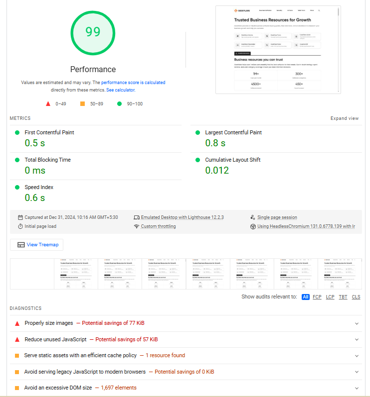
1. Geekflare Website Audit
Powered by Google Lighthouse
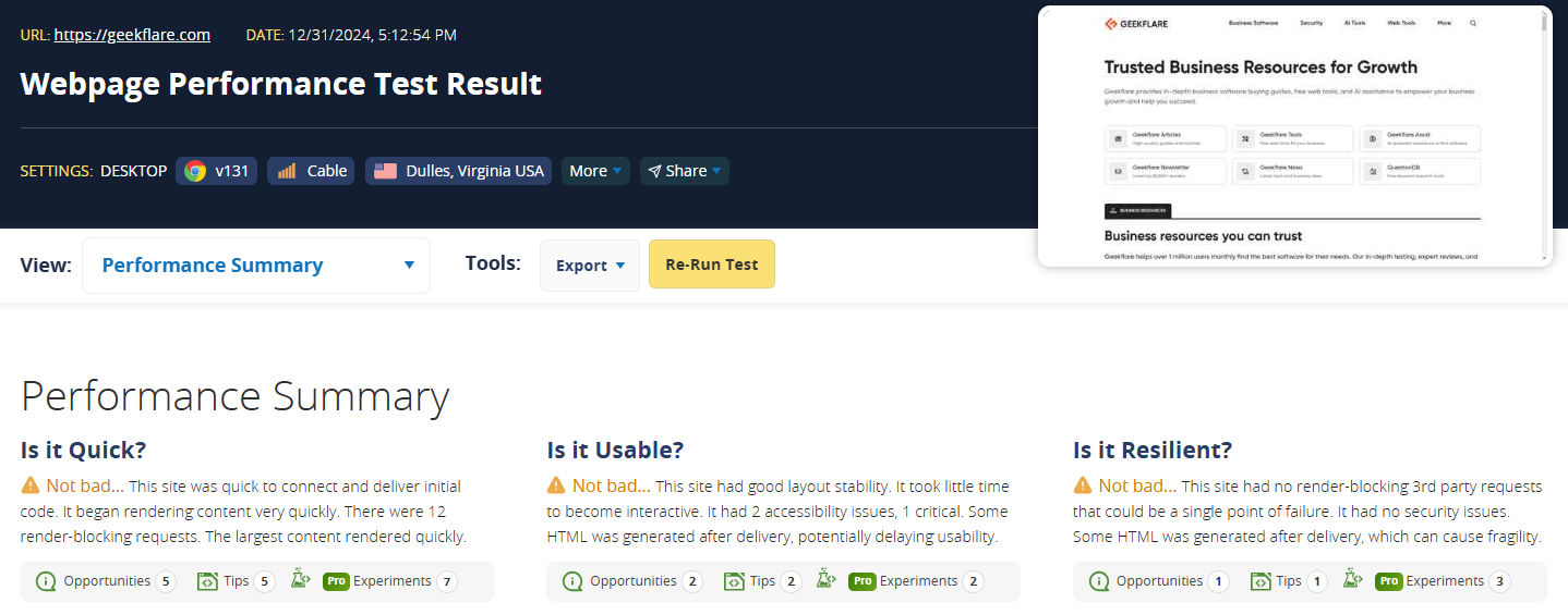
Geekflare Website Audit tool is a free and easy way to gauge a website on 50+ SEO, performance, best practices, and accessibility parameters.
Just input the URL address and choose the device, desktop or mobile, to run the test. The result provides server IP, test time and location, HTTP support, page size, number of requests, etc., as depicted in the following screenshot.
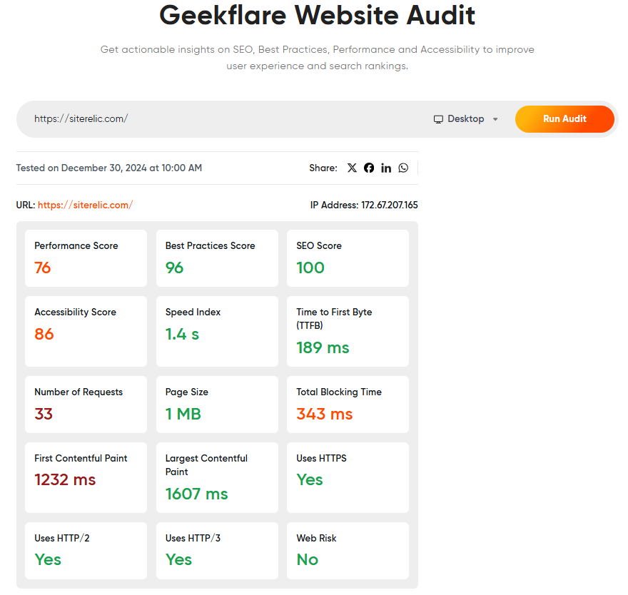
In addition to the score summary up top, the test report shows details of every audit and recommendations about each element. You can also share the report directly on Facebook, X, LinkedIn, and WhatsApp.
Geekflare Website Audit Pricing
Geekflare Website Audit is a 100% free tool you can use without limitations.
However, if you want to test your website’s load time programmatically, try Geekflare’s Lighthouse API. It has a free plan (500 monthly credits) and economically priced paid subscriptions starting at $9/month (5K monthly credits).
2. Uptrends
Offer Core Web Vitals, W3C timing metrics
Uptrends lets you see the impact of every website element, including images, CSS, and HTML, with its waterfall analysis. These reports also provide a visual timeline of page loading, allowing webmasters to check the load progression, HTTP request/response headers, and more to spot performance issues and bottlenecks.
The speed test tool reports Google PageSpeed Insights score, which reveals a website’s assessment of critical metrics such as First Contentful Paint (FCP), Time to First Byte (TTFB), and more.
If needed, you can evaluate page load experience for specific mobile devices, resolutions, and networks.
There’s also the provision to check desktop and mobile performance on Chrome and Edge from a vast network of 200+ global checkpoints. It works without signing up. However, you would have a smaller choice of 20 locations to test from that way.
Uptrends Pricing
Uptrends offers a 30-day free trial. Based on the use case, you can subscribe to the following offerings.
- Single Browser: $14/monitor/month
- Real User Monitoring: $9.20/month
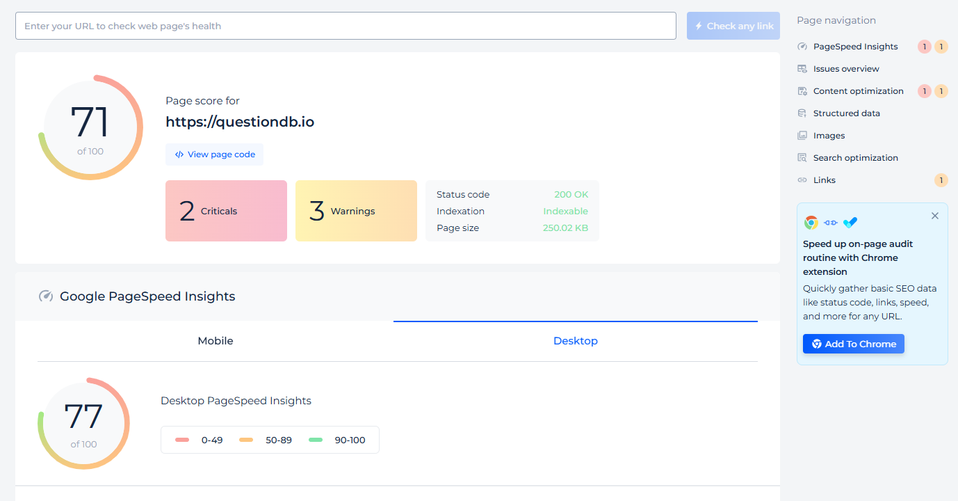
3. Sitechecker
Detailed Testing Reports
I value Sitechecker not only for its PageSpeed insights but the clutter-free way it presents those metrics. Its report details status code, page size, core web vitals, blocking time, speed index, and more. Plus, you get information about URL specifics, including HTTP support, hidden links, redirections, internal links, images, text, page headings, etc.
In addition to page-specific analysis, you can monitor the problems of an entire website. The side audit page lists all the pages, covering critical issues with links, indexability, content, security, page speed, code validation, search traffic, sitemaps, and redirects.
Sitechecker doesn’t stop at this and also indicates solutions.
You can set up automated monitoring with Sitechecker to get a historical overview of the changes and their impact.
While not directly related, Sitechecker subscriptions also come with Rank Tracker to monitor SERP ranking from different locations and devices. Plus, you’ll get an SEO dashboard to catch all the vital information from Google Analytics 4, GSC, and Sitetracker (audit and rank tracking) in one place.
Sitechecker Pricing
Sitechecker has a 14-day no-credit-card trial, after which you can upgrade to its paid plans (prices are valid when billed annually).
- Basic: $50/month
- Standard: $125/month
- Premium: $291/month
4. Google PageSpeed Insights
Best for Page Speed Optimization
Google’s PageSpeed Insights is the foundation of most website performance testing tools. Its popularity is well deserved since it comes directly from Google, whose search engine enjoys 89.74% market share.
PageSpeed Insights measures your website based on Google’s state-of-the-art core web vital assessment. You get the last 28 days of real-world average values of Largest Contentful Paint (LCP), Interaction to Next Paint (INP), Cumulative Layout Shift (CLS), First Contentful Paint (FCP), and Time to First Byte (TTFB).
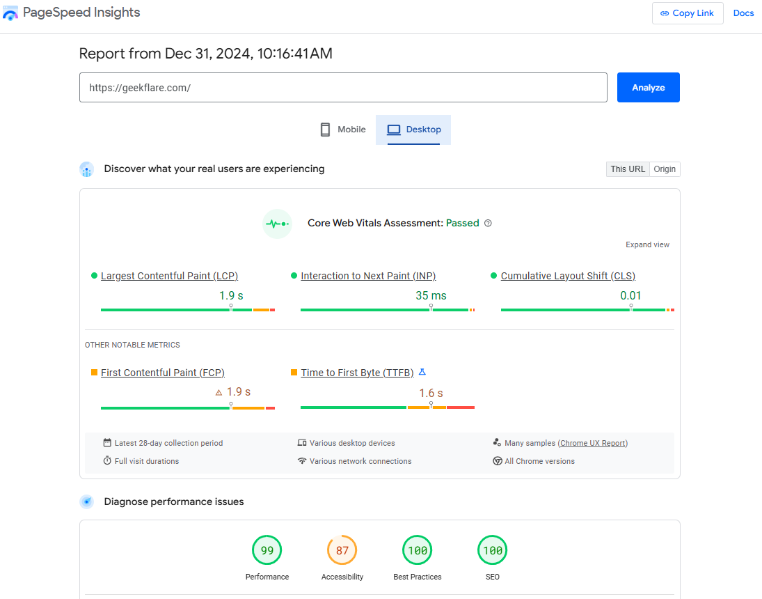
The checker also provides consolidated lab scores for performance, accessibility, best practices, and SEO. Each category has a detailed breakdown of every element and suggestions for improvements.
It’s a handy tool for any beginner.
On the downside, you don’t have any option to select the testing server locations. And though it gives performance scores for mobile and desktop, you will have to look elsewhere to simulate specific devices.
Google PageSpeed Insights Pricing
You can use Google PageSpeed Insights for free without needing to register. However, this is also its biggest limitation. There is no option for scheduled tests, and you don’t get to retrieve historical data.
It also has an API, which you can use for free with a limitation of 400 queries per 100 seconds (25k calls per day), per Google Search Console Help section.
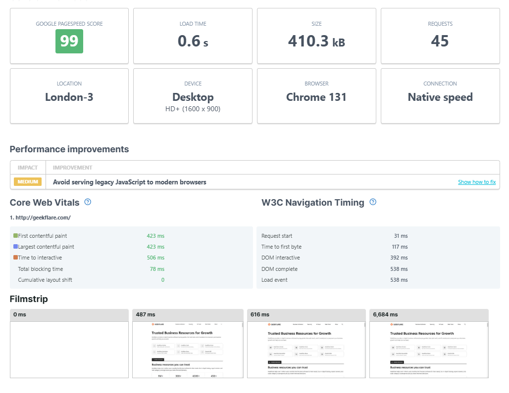
5. GTmetrix
Popular Developers Choice
GTmetrix is based on Google Lighthouse but comes with a few customizations (I’ll come to that), making it a developer favorite.
For one, GTmetrix is based on real browser-based testing using an unthrottled connection. Plus, it allows testing from specific locations, devices, resolutions, and connections.
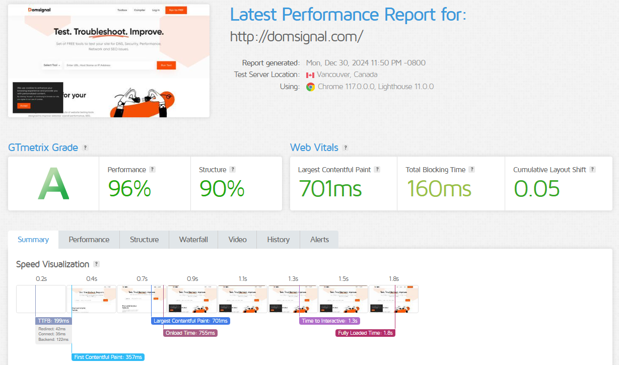
You can also create page-load videos and prevent ads.
Its advanced options support HTTP authentication, allowlist/blocklist resource loading URLs, and cookies. Developers can also opt for a custom DNS by using DNS override and adjusting the device pixel ratio.
GTmetrix Pricing
GTmetrix’s free tier provides 5 tests/month for 6 months. You can use this for testing from 7 global locations and with limited testing customization.
Paid plans start at $4.25/month and go up to $510/month based on individual and business requirements. You can also try its custom plan creator, based on specific monitoring, testing, and collaboration requirements.
6. Dotcom-Tools
Customized Testing in Free Tier
I chose Dotcom-Tools for its flexibility in testing, even without needing a signup. I could choose from multiple devices, resolutions, and network options to inspect web performance relative to 3 locations at once.
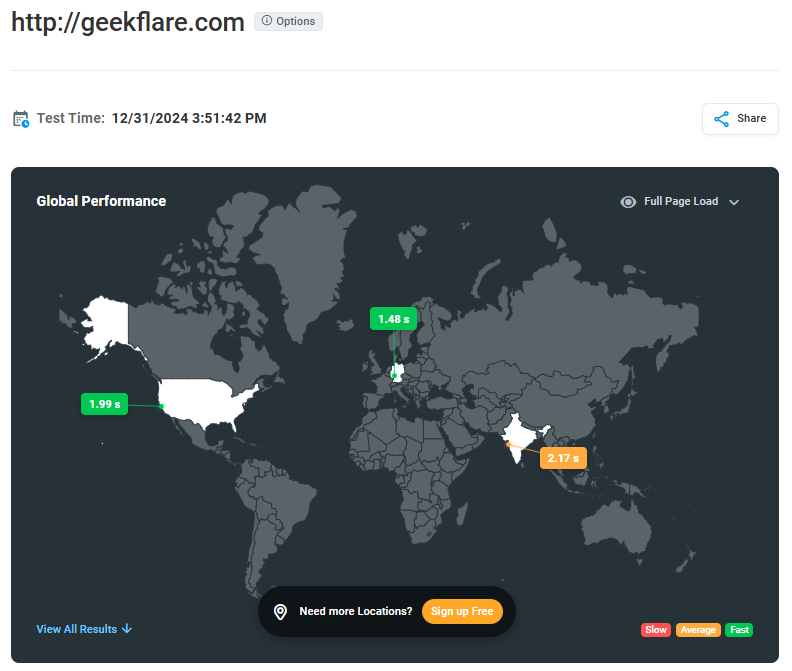
This instant testing reports times for full page load, first meaningful paint, latency, page size, and DOM complete.
Clicking on a location gives you a waterfall page load representation. You can see every web element and its URL, size, and overall effect on the loading time. A toggle at the top highlights just the errors.
Signing up unlocks more power. It allows you to save test reports, enable scheduled testing, and monitor performance from all 30 locations in one go.
Dotcom-Tools Pricing
Its free plan permits testing from 5 locations with a total of 250 tests/month. You can subscribe to the paid plans for more features, including a greater number of tests and automation. The prices below are valid when billed annually.
- Starter: $7.99/month
- Professional: $23.99/month
7. Pingdom
Quick Page Load Analysis
Pingdom is a straightforward page inspection tool I have used many times. It has a beautifully simple interface requiring the subject URL and the preferred testing location among 7 checkpoints.
Thanks to its popularity, your test will most likely be queued with others. Fret not; it takes only a few seconds to get the insights you need to optimize your website loading speed.
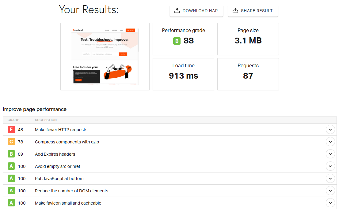
In addition to the tips for improving website performance, Pingdom displays response times, requests by domain and content type, and content size by type and domain.
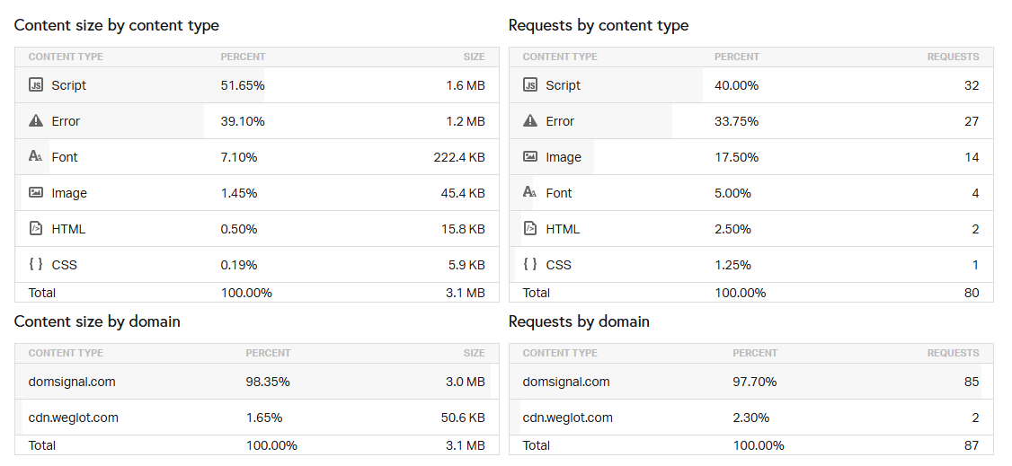
Not only this, but you also have waterfall charts, depicting the effect of every element on the page load sequence.
I personally use Pingdom website tests for my projects and I can’t recommend it enough.
Pingdom Pricing
Pingdom offers a 30-day free trial. Afterward, you can switch to the paid plans starting at $10/month.
8. WebPageTest
Best for Power Users
CatchPoint’s WebPageTest measures real user experience with support for advanced testing configurations.
Beginners can choose a connection type, screen resolution, and device to start with. Advanced configurations allow webmasters to ignore SSL errors, stop tests at DOM, capture network logs and full-size videos, decide test runs and minimum duration, inject JavaScript & custom headers, and more.
You can block specific requests and domains, simulate domain failure, and disable support for advanced image formats (AVIF & WebP). CatchPoint has also provided the flexibility to conduct a Lighthouse audit alongside.
The results are in-depth and pinpoint every aspect you might need to troubleshoot. You get the performance metrics, waterfall analysis, requested pie charts, a separate image analysis, core web vitals, and much more.
WebPageTest Pricing
A generous free plan awards 300 test runs from 30 locations, while storing 13 months of historical data. Paid plans start at $18.75/month and add 10 more locations, API access, integrations, bulk testing, custom metrics, etc.
9. WebSitePulse
Best for Testing Speed of Individual Page Elements
WebSitePulse is a straightforward tool to measure the download speed of the first 30 components of the subject web page. It considers redirections, DNS lookup, connection, and first and last byte to provide a net loading time of that specific element.
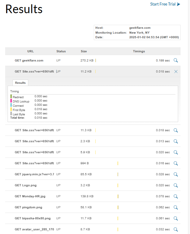
The free version lets you test from 3 locations: New York, Munich, and Melbourne.
While it doesn’t offer much more, you can use it for extensively testing the speed of individual components that you think could be slowing down your website’s load times.
WebSitePulse Pricing
This tool comes under the Website Monitoring module, which has a 30-day free trial. Paid plans start at $9/month and have customizations for the number of locations, data retention, monitoring frequency, etc.
10. Site 24*7
Best for Detailed Reporting
Site 24*7 allows you to test your project from over 130 worldwide checkpoints, indicating the DNS lookup, connection, and TTFB of every object. Its webpage summary also tells you about the number of requests and objects, with the total size of images, JavaScript, HTML, and CSS.
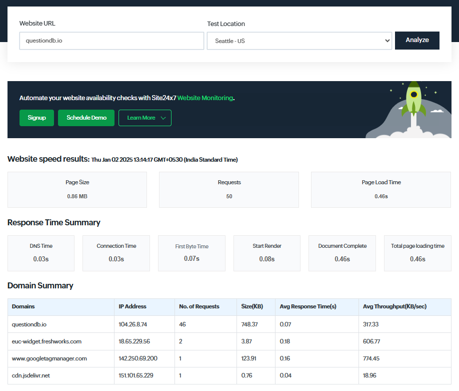
I could also see the useful waterfall analysis of the requests and how they impact the page load time. Basically, it provides the exact data as to which element you have to improve for a better user experience.
Site 24*7 Pricing
Site 24*7 has a free forever plan for monitoring up to 5 resources. Paid plans start at $9/month and offer features like automated testing, alert notifications, and simultaneous testing from multiple locations.
6 Best Practices for Improving Website Performance
Improving website performance is a multi-pronged approach, which often drills down to a specific object. In the last 3 years, I have used 6 primary website optimization techniques, as mentioned in the following sections.
1. Image Optimization
I ran a few tests and found that images constitute anywhere from 40% (for websites like Geekflare) to 80% (e-commerce stores like Amazon) of a standard web page. This is a big number, telling us the importance of image optimization.
Images are often the heaviest and most prevalent resource on the web. As a result, optimizing images can significantly improve performance on your website.
Web.dev
One very effective image optimization technique is using advanced formats, such as WebP and AVIF.
Compared to PNG and JPEG, WebP and AVIF offer better compression at no noticeable loss of quality to human eyes. Most modern browsers support WebP, including Chrome, Firefox, Edge, Safari, and Opera. AVIF also enjoys compatibility with popular browsers, barring Opera Mini.
Lazy loading is another way to optimize user experience. It loads images gradually based on the user’s viewport scrolling. This makes the web page usable “instantly” without downloading all the resources (images) upfront.
Finally, lossy and lossless compression also works without significantly affecting the visual experience.
There are multiple optimization services, such as ImageOptim and UploadCare, which can help you do this by offloading image loading to their servers.
2. Minify CSS, JavaScript, and HTML
Personally, I didn’t see any serious performance upgrades by minifying CSS, JS, and HTML for my WordPress-based blog. The improvement was always marginal (1-3%). However, it can work for projects with huge CSS/JS/HTML files.
Another downside of minification is it makes debugging difficult by making the code practically unreadable. Therefore, you need to keep an extra copy to make changes later.
Still, I would advise you to try minifying a few pages and checking results before applying this technique site-wide. In most cases, other optimization methods will work better.
Fortunately, WordPress users have multiple plugins (such as WP Rocket) for this. Moreover, some CDN providers (ex., Cloudflare) offer minification as an additional feature. There are also standalone tools, such as Minifier, where you can paste the standard code to get the “compact” version.
3. Content Delivery Network
Using a CDN (content delivery network) is unquestionably critical for anyone having a globally dispersed target audience. The logic is simple: having origin servers everywhere is prohibitively expensive and complex to maintain.
On the other hand, CDN is an economically practical solution that caches content at the network edge closer to the end users.
Not only does it reduce page load time, but it also guards a website against cyber threats (ex., DDoS) and increases content redundancy. Moreover, it’s an excellent solution for websites capped with bandwidth limits.
There are multiple free CDN providers. However, the experience can be counterproductive (yes, free CDNs can slow down your website) since scores of non-paying users usually bog down their services.
However, opt for any paid CDN service, such as Cloudflare or Fastly, and you’ll know why some of the biggest names (Netflix, Facebook, and more) rely on content delivery networks to serve their global user base.
4. Browser Caching
Whenever we visit any webpage for the first time, a browser cache policy (if present) tells a web browser to store specific elements on the local device. This helps the user load the webpage faster on subsequent visits and reduces the load on the origin or edge server.
Images, CSS, JavaScript, fonts, media files, etc., are some assets you should consider caching. The idea is to save static assets until TTL (Time To Live). After TTL, a web browser fetches a new version from the origin or edge server.
In fact, Google Lighthouse flags all the non-cached static assets with “Serve static assets with an efficient cache policy”—affecting the audit score. Developers overcome this by defining HTTP headers in the server configuration that tell a web browser to “locally store” or “cache” resources.
On the downside, users might still experience a “stale” version of your website until TTL expiry (or if they haven’t cleared the browser cache manually), even if you’ve made changes at your end. In addition, caching sensitive credentials is dangerous, especially if the user is on a public computer or becomes a data breach victim.
Therefore, browser caching is useful, but you need to be mindful of its application.
5. Server-side Caching
Server-side caching keeps a copy of database queries, assets, etc., on the server itself to avoid repeated computation for the same resources.
It’s fully controlled by the site admins, with no dependency on the user’s browser or device. The end goal is faster page loads for all users, including those visiting the web page for the very first time.
You can implement server-side cache with in-memory solutions like Memcached or Redis. Alternatively, CDNs offer a distributed caching solution to serve content via edge servers closer to users. Moreover, popular web hosts, such as Cloudways and SiteGround, provide built-in server-side caching.
6. Page Compression
Page compression or (just) compression refers to optimizing the size of text elements, such as HTML, CSS, and JavaScript. This technique deploys a compression-decompression cycle to reduce page size and enhance loading speed. Behind the scenes, compression removes duplicates and puts them in order again when users load the web page in their browsers.
You can deploy Gzip or Brotli, two leading lossless compression algorithms modern browsers support.
Generally, web hosting providers have this turned on by default. If not, you can configure compression by modifying the .htaccess file. In particular, WordPress users benefit from multiple plugins (ex., WP Fastest Cache, PageSpeed Ninja, & WP Rocket) with native support for page compression.
Optimize Your Page Load Speed With Website Checkers
Creating a website has become easier than ever. You can get started right now and go live within an hour. This fierce landscape has made page load speed one of the critical parameters everyone should work on, since thousands of websites fight for the same keywords in every category.
On the bright side, you have many tools with a free tier that troubleshoot speed. Check each listed tool and decide what serves you the best.