If you want your customers or website visitors to take the desired action, you need to direct them toward it. It’s no secret that they will just walk away without sparing another second on your website if you don’t tell them what’s next.
That’s when the call to action helps you.
As the name portrays, the call to action tells your customers about the action you want them to take. It is responsible for driving conversions on your page or website.
Your customers now desire more personalized and thoughtful CTAs. So, if you want to grab your customers’ interest, you gotta think out of the box.
Personalized CTAs can convert as high as 202% more than traditional versions.
On top of that, if your customers find your CTA with no value proposition, they will skip it with no mercy. And your call to action will drive no conversions.
Luckily, some ways can help you make your CTAs more effective and improve conversions.
In this article, we will discuss the top CTAs that will surely boost your page’s conversion rate.
What are CTAs, and Why are they Important?

CTAs, or call to action, are words or phrases intended to drive your customers’ interest to head to the next step, exactly where you want them to be. It could be anything from purchasing something to subscribing to your email list or downloading the freebie.
Call to action helps drive desired actions or conversions from your audience by encouraging them to take action immediately through compelling words or phrases. They are the prompts or instructions that encourage your website visitors or customers to take a specific action. It includes purchasing, filling out a form, or signing up for a newsletter.
The primary purpose of CTAs is to turn passive website visitors into active and engaged customers. When used correctly, CTAs can help maximize the impact of your marketing and sales campaigns.
However, it’s crucial to learn about the pitfalls as well as the proven ways to do your CTAs work more effectively. To drive more value from your CTA, you must communicate the value of taking a specific action.
In addition, ensure making it easy for the users to do so. This way, you’re sure to increase conversion rates and drive growth for your business.
What’s more, the implementation of effective CTAs facilitates you to track and measure the effectiveness of your marketing and advertising efforts. It enables better optimization of your business strategies and increased returns as well.
Best Practices for Creating a Good CTA

A CTA can be referred to as a marketing tool that serves various purposes but with the same end goal; it initiates a response from the user. While crafting a potent CTA, one must consider a few points mind.
Keep it Simple and Clear
First, you must ensure an easily understandable and straightforward CTA is in place. Don’t make it complex by introducing big terms or complex language, as it may confuse the visitor resulting in lousy conversion rates.
Make it Actionable
Use action-oriented language such as “Sign up now,” “Learn more,” or “Get started” to produce a sense of immediate action in the reader’s mind.
Use Strong Verbs
Craft your CTA using strong and active verbs. It can be something like “Join,” “Download,” “Start,” or “Get” to make it look more compelling.
Visually Appealing
Your CTA’s design carries much more weight than you think. A perfect call to action must have contrasting colors and bold text. Try adding something to make it pop off the page. It should be something that stands out from the rest of the content of your page.
Put it in a Prominent Location
Place your CTA in a prominent location, such as above the fold or near the top of the page, where it can easily be seen and makes sense.
Personalize it
Customize your CTA to your target audience, using language and images that resonate with them. Tell them you’re talking to them.
Test and Optimize
Last but not least, try playing around with different CTAs and check which resonates best with your audience. In addition, you must consistently optimize and improve your CTAs based on performance data you gather using heatmap tools.
Now we will discuss the top CTAs that will surely boost your page’s conversion rate.
Read/Learn More
The most widely used yet effective CTA has to be this! It’s one of the best ways to direct your visitors to the next best step in exchange for offering value. You’re building trust and credibility by providing additional information to your potential customers.
Here’s what a “learn more” button looks like:

Keep your CTA short and crisp, as it will make it more persuasive. Another point to keep in mind about CTA is to place it at the appropriate location on the page and somewhere it is easily visible and accessible.
You can make add-ons with familiar words such as “Learn more about what we do,” etc. A well-crafted CTA must direct the user to relevant information and create a sense of urgency. It can help convert more visitors into customers and increase conversions on your website.
Lead Magnet CTAs
Lead magnet CTAs work by encouraging your targeted audience to take a specific action, typically to exchange their contact information for something valuable. A lead magnet is a marketing term that represents a free product or service. It’s the value proposition – it could be an ebook, webinar, discount coupon, etc.
Here’s what a lead generation call to action looks like:

A lead-magnet CTA is typically included in the material intended to draw in the target audience, such as a landing page or any other piece of content. It can be a button, a form, or a hyperlink that takes the visitor to a page where they can input their contact details.
Once the user takes action, they will get the lead magnet in exchange for their contact information. It can also be understood as the first step in the sales funnel when the goal is to generate leads for further nurturing and conversion.
A newsletter subscription CTA is a prompt or button that encourages a website visitor to sign up for a company’s email newsletter. You’ll generally find these types of CTAs at specific locations on a website, such as a header, footer, or sidebar.
What’s more, newsletter subscription CTAs are paired with provoking language that incentivizes the visitor in exchange for taking action. Some examples include “Get exclusive offers” or “Stay informed with our latest updates.”
Here’s what a subscribe to newsletter call to action looks like:

When a visitor clicks on the given CTA, it will direct them to a form where they’ll be required to enter their contact information, such as email address, name, location, etc.
After successfully submitting the form, they are officially subscribed to your company’s newsletter. And you can add them to your email list using email marketing tools. After that, they’ll be able to receive regular updates from the company.
Newsletter subscription CTAs work by converting website visitors into subscribers. It allows companies to build relationships with their audience and keep them informed about new products, services, and promotions.
Contact Form Submissions
A contact form is a web-based tool through which users can send messages or inquiries to a website owner or administrator. It provides a convenient way for visitors to get in touch with a website’s owner, without having to directly reveal their email address.
Typically, a contact form is displayed on a web page and contains a set of fields that the user must fill out.
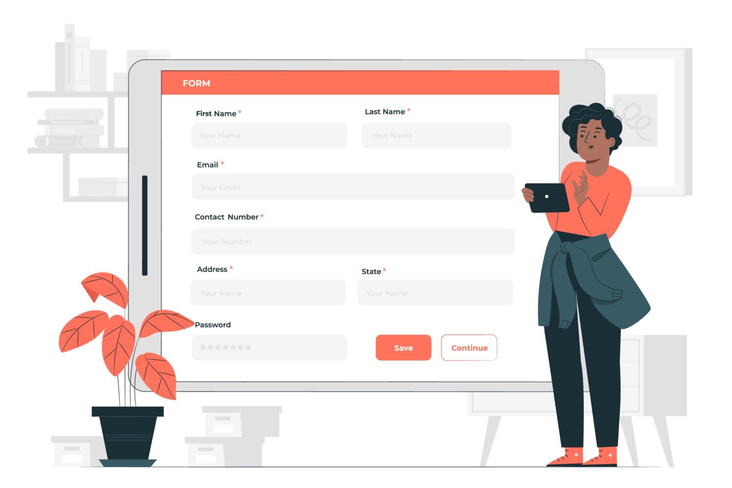
The required information might include the following:
- The user’s name.
- Email address.
- The subject of the message.
- The actual message itself.
The website owner gets notified about the information when the user clicks on the “Submit” button after filling out the details.
Event Promotions
Event or limited-time promotions are a great way to grab your audiences’ attention and take them to the next step quickly. These CTAs inform your visitors about the latest promotions that your company runs and help them with further details.
Here’s what an event promotion call to action looks like:

While crafting powerful yet wise event promotion CTAs, one must remember to accommodate words that evoke a sense of urgency in your audience. Adding a pinch of personalization could be the cherry on top.
Some best examples of event promotion CTAs could include “Get my offer,” “Shop now and save,” or “Claim my discount.”
Not to mention, if you are smart enough to notice that these examples talk in the first person. This step simply enhances the power of your CTAs.
Social sharing buttons enable your audience to easily share your content that they might find relevant, thus, in turn, helping you attract more traffic. But just placing them there won’t do the job anymore; using a powerful call to action is essential to get the best out of your efforts.
To reap the benefits of your social sharing buttons, you must first focus on properly placing the buttons. They could be adjusted anywhere from your blogs to any other share-worthy piece of content. Note to place it at a location where it’s easily accessible.
In this example, when the users read the article, they’re free to share it on their social media channels if they find it relevant.
Here’s what a social sharing call to action looks like:

Lead Nurturing
Lead nurturing is an essential component of a successful marketing strategy, and call to action (CTAs) play an important role in the process. By offering targeted content, lead nurturing CTAs create a customer journey, delivering the right message to the right person at the right time.
A lead-nurturing CTA aims to attract potential customers, build relationships, and turn leads into loyal customers. These CTAs focus on ensuring a user’s experience is personalized, effective, and relevant.
Here’s what a lead nurturing call to action looks like:

Some standard lead nurturing CTAs include downloadable content like white papers and ebooks, registration for webinars and events, forms to schedule a consultation, product trial downloads, and discounts on a specific product or service.
Using the right CTAs, you can nurture leads, engage them, and ensure that your company’s product or service is top of mind for potential customers.
Whether it’s a blog post or newsletter, related content plays a critical role and is an important aspect of increasing the effectiveness of your content and marketing.
Related content CTAs encourage the readers to engage with the content by providing additional, related content that adds more value to their experience. You can incorporate related content through hyperlinks, including adding suggested links at the end of posts or relevant CTAs at appropriate locations.
Here’s what a related content call to action looks like:

You must remember that CTAs should be used sparingly and strategically to maximize the effectiveness of a blog post. If you do it the right way, related content CTAs can help increase engagement on your posts while increasing the reach.
Free Trial/ Demo
Free trial/demo CTAs can help encourage your audience to try your products/services a. These types of CTAs are used when you’re giving away a demo of your offers to your audience before they invest their money.
Here’s what a free trial call to action looks like:

When you use free trial CTAs, they can help excite your audience about your products.
However, it’s important to note that to get your audience working; you must state the benefits of claiming your offer while easing the objections.
BigCommerce has done a great job with its free trial CTA. They communicate what value the visitor can get in exchange for clicking that free trial button.
Contact Sales
This type of call to action directly gives a message to the visitor to contact sales and is very sales focused. These CTAs target potential customers for your products and services.

You can consider placing these CTAs on product or service pages, as these are helpful in converting leads into customers.
FAQs Related to CTAs

Some common CTA mistakes include poor placement of the CTA, using confusing language, lack of urgency, no incentive, unappealing design, adding too many CTAs, lack of personalization, and no testing.
It’s generally considered that too many calls-to-actions can be overwhelming for the user and can dilute the message. A cluttered or confusing layout with multiple competing CTAs can result in confusion and lower conversion rates. Having a clear, concise message and one primary or a few CTAs per page is best.
Here are the steps to A/B test CTAs:
Choose two different CTAs: You want to test two different calls to action (CTAs).
Determine the goal: Decide what you want to achieve with your CTA. For example, do you want to increase the click-through and conversion rates or generate more leads?
Create a hypothesis: Develop a hypothesis about which CTA is more likely to achieve the goal.
Set up the test: Use a tool such as Google Optimize or VWO to set up the A/B test.
Split the traffic: The A/B testing tool randomly splits your website traffic between the two CTAs. It will allow you to see how each CTA performs with different audiences.
Collect data and analyze: Observe how each CTA performs over a set period.
Make a decision and repeat: Based on the results of the A/B test, make a decision about which CTA to use on your website moving forward. And ensure to test and improve your CTAs continuously.
Conclusion
CTAs can never fit the one-size-fits-all criteria. With differing goals, you’ll need to place relevant CTAs. However, one thing that doesn’t change is that your CTA should be compelling enough to prompt a response from the user’s side. So put in your best efforts and go in with a solid CTA!
You may also explore some best lead generation software for startups to enterprises.

